Covers the October 8, 2026 launch. Plans and features checked 2026-10-11. Both are in beta, so details may change.
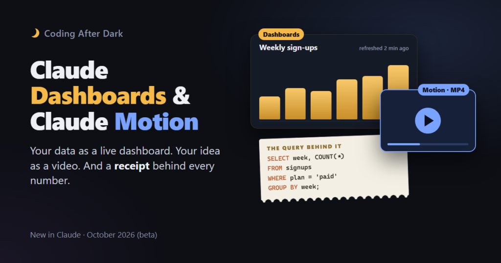
On October 8, Anthropic gave Claude two new skills. Claude Dashboards turns a question about your company’s data into a page of charts that keeps itself up to date. Claude Motion turns an idea, a report or a chart into a short animated video.
Both are easy to show off. But the most useful part is a small detail: every chart in a Claude dashboard comes with the exact query that produced it. That’s the difference between “the AI says sales are down” and “here’s how the AI counted, so you can check it.”
Claude Dashboards: ask a question, get a chart that stays current
Most companies keep their numbers in a data warehouse: one big, organized store of business data, like sales, sign-ups and support tickets. Getting answers out of it usually means writing SQL, the language used to ask databases questions. Or it means asking someone who can.
With Dashboards, you ask in plain English instead. Something like “show me weekly sign-ups for the last six months, split by country.” Claude then:
- Writes a SQL query for each chart and runs it against your data.
- Builds the dashboard, a page with all the charts together.
- Keeps it updated as your data changes, and shows when each chart was last refreshed.
You can then ask for changes in chat (“add a filter for paid customers only”), or open a chart’s query and tell Claude what to fix.
The receipt behind every number
Think of each chart like a restaurant bill that comes with an itemized receipt. You don’t have to read the receipt every time. But when a total looks wrong, it’s right there.
That matters because AI-written queries can be confidently wrong. They can quietly count cancelled orders, use the wrong date range, or match two tables incorrectly. Anthropic’s help article says each chart shows its query “so you can verify what it counts.” If you don’t read SQL, you can ask Claude to explain the query in plain words.
What it connects to
- Data warehouses: Amazon Redshift, BigQuery, ClickHouse, Databricks and Snowflake.
- Other apps connected to Claude, such as Salesforce.
When you need more than a quick look, you can send a dashboard on to analytics tools like Amplitude, Grafana, Hex, Mixpanel, Omni, PostHog or Sigma. Anthropic lists Looker, monday.com and Tableau as “coming soon.”
Who can use it
| Dashboards | Motion | |
|---|---|---|
| Free | No | No |
| Pro and Max | Yes (beta) | No |
| Team | Yes (beta) | Yes (beta), on by default |
| Enterprise | Yes (beta), an admin must turn it on | Yes (beta), an admin must turn it on |
Checked 2026-10-11 against Anthropic’s help center.
Both count toward your plan’s usage limits. Anthropic hasn’t published how much each one uses.
What it’s not
Anthropic describes Dashboards as built for “quick, exploratory questions” and suggests moving to another tool for deeper analysis. It isn’t meant to replace your company’s official reporting. If a number goes in front of the board, it should still come from somewhere a person has checked.
Claude Motion: your idea as a short animated video
Motion turns a prompt into an animated explainer that plays like a short video: a 30-second update for an all-hands meeting, say, or a quick product walkthrough. You can attach a report, some data or images, and Claude works them in.
To start, ask Claude for an animation in any chat, or choose Output, then Motion, in the message box. When it looks right, click Export and download it as an MP4, the standard video file that plays almost anywhere.
It’s animation, not AI video
This is the part people get wrong. Motion doesn’t use a video generation model. There’s no realistic footage and no AI-generated people. Instead, Claude writes code that moves your text, charts, shapes and images around, a bit like an automatic version of slide animations.
That has two upsides:
- You can change one detail without redoing everything. Fix a number, slow down one scene, reword one line. The rest stays put.
- Your numbers stay your numbers. Because it animates your actual chart, it can’t make up a prettier one.
The trade-off is that it’s for explaining, not for cinematic ads. If you need people on screen, you’ll still need a camera or a different tool. For polishing, Anthropic says you can open the result in tools like Adobe, Descript, HeyGen, Runway and others.
Motion is only on Team and Enterprise plans for now. Longer or more complex animations use more of your plan’s limit than a normal message.
Also out on October 8: Docs, Slides and Design for everyone
On the same day, Claude’s Docs, Slides and Design tools left beta and are now on every plan, including Free. If your company uses Enterprise, they switch on by default on October 15, 2026. The old standalone Claude Design site stays open until December 14, 2026, so move anything you need before then.
Try it with a CSV: build a dashboard in chat
Claude Dashboards needs a data warehouse or a connected app. Most of us just have spreadsheets. The good news: you can still get a dashboard-style page by uploading a CSV file (a plain spreadsheet file, one row per line, values separated by commas) to an ordinary Claude chat.
There’s one big difference. A chat dashboard is a snapshot. It shows the data you uploaded and never refreshes itself, and you don’t get the query-behind-every-chart receipts. For a quick look at a file, that’s fine.
Here’s a walkthrough with real, free data: the US unemployment rate.
We tested the download on 2026-10-11. We haven’t run these prompts in Claude yet, so your results may differ.
Step 1: download one year of data
The St. Louis Fed runs FRED, a free library of economic data. Its Unemployment Rate series (code UNRATE) comes from the US Bureau of Labor Statistics. It’s government data, so FRED marks it as public domain, as long as you credit the source.
This link downloads the twelve months from October 2025 to September 2026 as a CSV: download UNRATE.csv from FRED. To pick different dates, change cosd (start) and coed (end) in the link.
Open the file and you’ll see two columns: observation_date (the first day of each month) and UNRATE (the rate, in percent).
You’ll also see something odd: only 11 months, not 12. October 2025 is missing. That’s not a download error. During the government shutdown that fall, the survey behind the unemployment rate wasn’t carried out, and the Bureau of Labor Statistics says that month’s data “were not collected.” Real data has gaps like this, so it’s worth knowing how to handle them.
Step 2: upload it and ask for a dashboard
Start a new Claude chat, attach the CSV with the paperclip button, and paste this:
This CSV is the US unemployment rate from FRED (series UNRATE),
one row per month. Build me an interactive dashboard with:
- a line chart of the rate over time
- the latest value, and the change since the first month in the file,
  as big numbers at the top
- a small table of all the months underneath
October 2025 has no value: treat it as missing, not zero, and leave a
gap in the line. Add "Source: U.S. Bureau of Labor Statistics via FRED"
at the bottom.
The prompt tells Claude what the data is, what you want to see, how to handle the missing month, and how to credit the source. Without the missing-month line, a chart might quietly draw the line straight through October, or worse, drop it to zero.
Step 3: customize it, one chat at a time
Now refine it by just asking. Send these one at a time and watch the dashboard change:
Add a dotted line showing the 3-month average.Highlight the highest and lowest months in the table, and label them on the chart.Make the y-axis start at 3.5% so the changes are easier to see,
and add a note under the chart saying the axis doesn't start at zero.Use dark colors to match a podcast website, and make it readable on a phone.Two habits help here:
- Change one thing per message. If something breaks, you know which request caused it.
- Check one number yourself. Find September 2026 in your CSV (4.2) and make sure the dashboard shows the same.
Step 4: keeping it current
Because it’s a snapshot, it won’t update on its own. When a new month comes out, download a fresh CSV, upload it in the same chat, and say: “Here’s updated data. Rebuild the dashboard with it and keep everything else the same.” If you want a dashboard that refreshes by itself, that’s what Claude Dashboards and a connected data source are for.
What to watch out for
- Check one number you already know. Before you trust a new dashboard, look for a figure you’re sure of, like last month’s sales. If Claude’s number is different, open the query and find out why. (This is advice from early third-party guides and from us, not from Anthropic. Nobody had published hands-on testing when we checked.)
- Give it read-only access. Anthropic’s help article doesn’t cover permissions. Whoever sets up the data connection should use an account that can read your data but not change it. That’s good practice for any tool that touches business data. (Our advice, not an Anthropic instruction.)
- Spreadsheets aren’t on the list. The supported sources are data warehouses and connected apps. If your business runs on Excel files, the Dashboards feature isn’t for you yet, though the CSV-in-chat route above gets you a snapshot. Early users asked the same question, and there was no answer when we checked.
- It’s a beta. Expect changes, rough edges and usage limits nobody has put numbers on yet.
After After Dark To Try
- If you have a spreadsheet instead of a data warehouse: follow the CSV walkthrough above with the unemployment data, then try it on a CSV of your own.
- If you’re on a paid plan with a connected data source: ask Claude for a dashboard answering one question you already know the answer to. Open the query behind the main chart and ask Claude to explain it in plain English.
- If you’re on Team or Enterprise: ask for a 30-second Motion explainer of one chart from your last report. Change one number in the editor and watch the rest stay the same.
- On any plan, including Free: try Claude Slides or Docs, which left beta on the same day. Turn this week’s notes into a five-slide deck.
Sources
Data for the CSV walkthrough
- FRED: Unemployment Rate (UNRATE): monthly, percent, seasonally adjusted, from the U.S. Bureau of Labor Statistics; tagged “Public Domain: Citation Requested”. CSV downloaded and checked 2026-10-11 (11 rows for October 2025 to September 2026; latest value 4.2 for September 2026).
- BLS: The Employment Situation, November 2025: “Household survey data for October 2025 were not collected due to the federal government shutdown.”